ANIMATED THEMATIC MAPS

Animated maps allow the transformation of raw data into narrative flows that tell the story of a world in continuous transformation. They allow highlighting the location, chronology, scale and rhythm of the occurrence of certain phenomena, the reconfiguration of borders, membership in certain organizational structures and continuous geopolitical movement. The propagation of certain events is visible, the highlighting of certain routes, but also the sometimes asymmetrical development resulting from cultural, civilizational, political or religious differences. The cartographic flow becomes an immersive experience by integrating images or video sequences that evoke the spirit of the era. Synchronized audio explanations complement the visual information.

Global spread of the printing press

Global spread of the printing press
since its beginning until 1892 (selection)

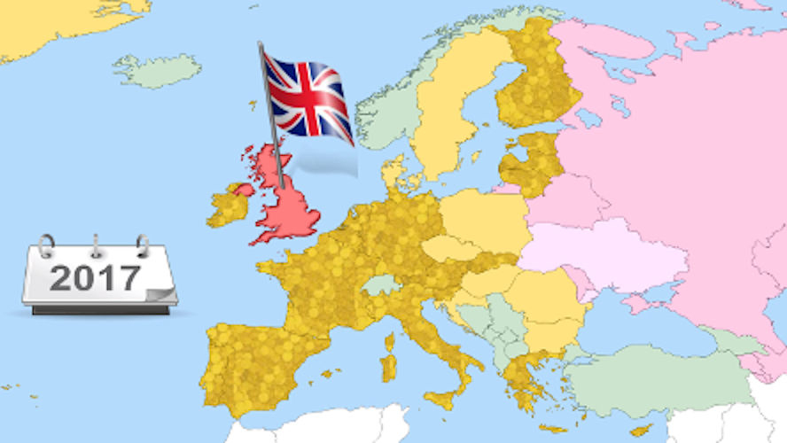
The animation depicts the global expansion of printing, from its origins to the dawn of the 20th century. The data is structured on three levels:
1. Spatio-Temporal Dynamics
On a world map, the emergence of printing centers is progressively marked by landmarks that remain fixed, generating a visual accumulation effect. The evolution is synchronized with a chronological calendar, for the perception of the location and cadence of the phenomenon.
2. Narrative and Atmosphere
The experience is supported by a soundtrack with audio explanations, and images have been inserted into the cartographic flow to evoke the atmosphere of the moment. Thus, the animation becomes a window into the social context of each era.
3. Analysis of the Civilizational Rhythm
Beyond chronology, the work highlights the asymmetries of global development. The map highlights the different rhythms of technology adoption depending on cultural, civilizational, political and religious factors, which have accelerated or, on the contrary, slowed down press freedom.

Proto-globalization of food

Proto-globalization of food
The exchange of spices, plants and animals

The animation analyzes the transition from the restrictive diet of Europeans in the Middle Ages to contemporary diversity, following the gradual introduction of the consumption of spices and new plants and animals.
The core of the animation is represented by an interactive world map on which the itineraries that changed the course of history are traced: the Spice Routes, Christopher Columbus' first voyage to the New World, Vasco da Gama's to the Indies and Magellan's around the world. Images that convey the atmosphere of the era, as well as the spices, plants and animals that crossed the oceans in both directions, are inserted into the cartographic flow. The visual component is synchronized with an explanatory audio narrative.
The conclusion is provocative: the exchange of spices, plants, and animals across the globe has become so profound that no traditional cuisine can claim pure authenticity anymore.

Proto-globalization of food

European Union
from the beginning until 2018

The animation begins with a map of post-war Europe, showing the countries and their affiliation to the two major blocs: Western (capitalist) and Eastern (communist). The first states that formed the European Coal and Steel Community (ECSC) are highlighted in color. The audio narration explains the transition from war industry to supranational cooperation, while the colors expand with the signing of the Treaties of Rome, marking the birth of the Common Market. As the digital calendar rapidly advances, the acceding states are progressively colored. The audio explanations emphasize the merger of executives into the European Communities. The visual climax occurs in 1993, when the disparate entities crystallize under the aegis of the European Union. A vibrant overlay gradually marks the countries adopting the Euro currency. Another map, of mobility, shows the expansion of the Schengen Area by eliminating border controls. Geopolitical reconfigurations (German unification, Eastern Bloc fragmentation and subsequent accessions) are faithfully captured, using chromatic transitions to illustrate the continuing evolution. The finale offers an overview of Europe, a symphony of colors representing the various levels of integration, as well as some possible future projects. The animation was created in 2018 and stops at that point. It has not been continued or updated - for now.

© Copyright 2022 Adriana Bogdan. All Rights Reserved.

Make a site with Mobirise